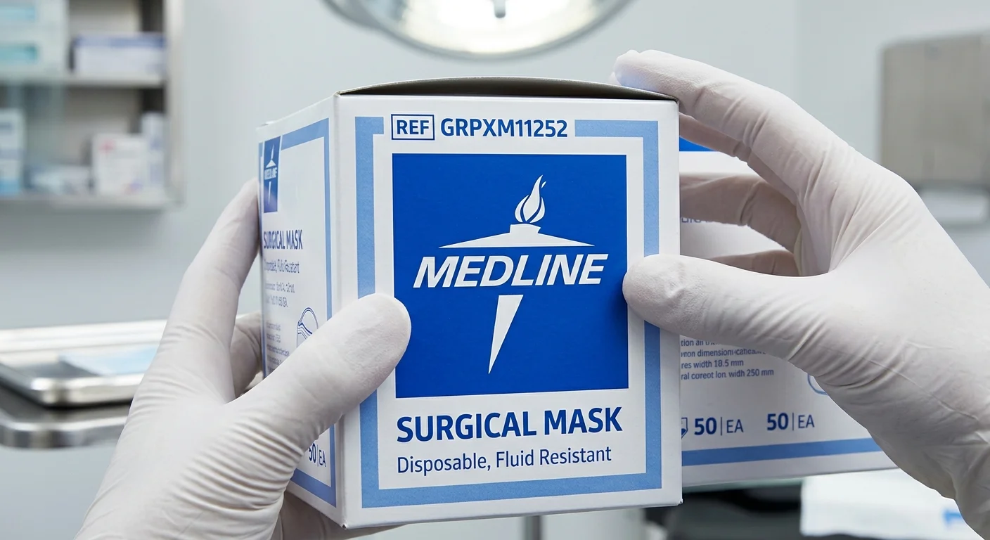
Spotting a fake shouldn’t require a medical degree. But with counterfeit medical supplies, the stakes are real and high. A misprint here, an off shade of blue there — and you’re holding a product that never passed Medline’s quality standards.
The Medline logo is more than a design choice. It’s a trust mark built on decades of integrity in healthcare manufacturing.
Are you a hospital procurement manager checking a new supplier? Or a caregiver making sure the
gloves
you ordered are real? Either way, recognizing authentic Medline branding is a practical skill worth having.
What follows is a close, clear-eyed look at every visual detail that separates the genuine article from a convincing imitation. Plus, you’ll spot a few red flags that are easy to miss.
What does the Official Medline Logo Look Like?

Three elements. Always three. The Medline torch icon, the “
MEDLINE
” wordmark, and a solid blue square — all three stay together, every time, as one fixed unit.
Picture it this way: a clean, flat blue square. Not a rectangle. Not a circle. Never cropped at the corner. Inside it, you’ll find a white torch and white all-caps lettering. No gradients. No drop shadows. No texture underneath. Just that solid, confident blue — PMS 2935 C, or #0052CC on screen — with white sitting on top.
Typography matters here, too. “MEDLINE” uses full uppercase, sans-serif letterforms. The strokes are consistent and even. Nothing bold. Nothing italicized. Nothing stretched.
Quick visual checklist:
– Blue square is solid and uncropped
– Torch + wordmark sit together inside it — never floating apart
– White text, flat color, zero visual effects
– Proportions look balanced, not squeezed or skewed
Any of these look off? Something is wrong.
Step 1 — Check the Square Shape and Overall Logo Structure
The square is everything. Before you read a single word on the packaging, before you check the color or squint at the font — find the square.
A real
Medline logo
is one solid block. It’s a closed blue square. Inside that square, you’ll find a torch icon
and
the “Medline” wordmark — both of them, together, locked inside. Not the torch floating alone on the left. Not “Medline” sitting in a horizontal banner beneath it. One square. Both elements. Every single time.
Here’s the 10-second check you can do right at the receiving dock:
Step one — confirm the shape (3 seconds)
Does it look square? Or does it read as a wide horizontal strip or a tall narrow column? A legitimate logo has a length-to-width ratio between 0.95 and 1.05. Anything wider or taller than that range? Not a square. Not compliant.
Step two — verify both elements are
inside
(3 seconds)
The torch and the wordmark must both sit inside that single blue boundary. One element crossing outside the frame — by any amount — disqualifies the whole logo unit.
Step three — scan for stragglers (4 seconds)
Look around the rest of the packaging. A lone torch with no frame? A standalone “Medline” text without a blue square behind it? Both are signs of non-compliant logo use. On counterfeit medical supplies, that pattern shows up again and again.
Quick audit checklist:
– ☐ Closed blue square present?
– ☐ Torch
inside
the square?
– ☐ “Medline” wordmark
inside
the same square?
– ☐ No isolated torch or text placed on its own elsewhere on the pack?
All four checked? Move to Step 2.
Step 2 — Verify the Color Combination (Blue + White, No Exceptions)
Color doesn’t lie — but counterfeiters count on you not looking close enough to catch it.
The
official Medline logo
colors are fixed. No room for variation. You’re looking for a deep, solid blue square. The torch and “MEDLINE” wordmark must appear in pure white. No gradients. No metallic sheen. No exceptions. That blue falls in the #0052CC–#0057A8 range — a saturated, bold color. It reads as true blue. Not gray-blue. Not purple-blue. Not slate.
Here’s the quick check. Hold the packaging under normal white light (500–1000 lux works well). Look at the white elements. They should read as clean, bright white — sharp against the blue background. Not gray. Not off-yellow. A washed-out “white” compared to the surrounding paper? That’s a red flag. Take it seriously.
Common fake color patterns to reject:
–
Black box
instead of blue — disqualify on sight
–
White background, blue text only
— no solid blue frame means non-compliant
–
Colorful torch
(orange flame, yellow gradient) — the torch must be solid white, nothing else
–
Gray or blue-gray box
— “not quite blue” means it’s not the real thing
–
Gradient blue background
— authentic Medline branding uses flat, solid color
Color audit check:
– ☐ Bottom box is solid, deep blue (not gray, purple, or teal)?
– ☐ Torch and wordmark appear clean white — not grayish or off-tone?
– ☐ Blue-to-white contrast looks bold and sharp, not muddy?
All three confirmed? Move to Step 3.
Step 3 — Confirm the Torch and Wordmark Are Always Together
The torch and the word “MEDLINE” are not two separate design elements. They are one — and they must always appear that way.
Inside the blue box, the layout is fixed: torch on top, centered. “MEDLINE” sits below it, also centered. Both stay locked inside the same blue boundary. That stacked order never changes. No side-by-side version. No torch floating alone. No “MEDLINE” outside the frame.
This matters more than it sounds. Counterfeiters often split the elements apart — a torch icon on the front panel, the brand name buried in a text block below. It looks fine at a glance. It isn’t compliant.
What to look for, one element at a time:
The blue box exists
— no rectangular border? Stop here. Flag it.Torch sits inside the box
— no part of it crosses or touches the edge“MEDLINE” is inside the same box
— not below it, not beside it, not elsewhere on the labelTorch is on top, wordmark is below
— the order is non-negotiableBoth appear together, every time
— on the label, on the seal, on every instance across the packaging
Step 3 Checklist:
– ☐ Blue rectangular box present?
– ☐ Torch contained inside the box?
– ☐ “MEDLINE” inside the same box — not external?
– ☐ Vertical stacking: torch above, wordmark below?
– ☐ No isolated torch or standalone text anywhere on the pack?
One failed check is enough. Treat it as a red flag.
Step 4 — Inspect Print Quality as a Counterfeit Indicator
Print quality is where counterfeiters get caught — and where they get away with it. Most people don’t look closely enough. That’s the gap fakers exploit.
Genuine Medline packaging runs on commercial-grade presses at 2,400–4,800
dpi
plate resolution. At that level, every edge is surgical. Run a 10× loupe over the brand name or barcode. The lines stay clean, continuous, unbroken. No stair-stepping. No ink bleed. No fuzzy halos around the letters.
A counterfeit comes off a desktop inkjet or low-end digital press. It can’t match that. The individual ink dots — 30–60 μm across — show up under a basic 5× magnifier. Edges look pixelated. Fine lines waver or thicken at intersections. You’ll see it.
Run this four-point check before accepting any shipment:
Edge sharpness
— Use a 5×–10× magnifier on text and logo lines. They should be solid and consistent. Jagged or stepped edges are an immediate red flag.Color uniformity
— Hold the package at 30–40 cm in natural light. No streaks, banding, or cloud-like patches should show up across any solid color block. Pull out 3–5 boxes and compare them side by side. Visible color shifts between units point to non-professional printing.Registration accuracy
— Check the Medline logo and any colored borders. A real print keeps multi-color misalignment within ±0.05–0.15 mm. Past 0.2–0.3 mm, you’ll see colored ghost edges — thin red, blue, or yellow shadows fringing the artwork. No magnifier needed for that.Ink durability
— Take a dry tissue and rub it across the printed surface 5–10 times. Authentic Medline product authentication packaging uses abrasion-resistant inks. Nothing transfers. Heavy color pickup on the tissue? That’s a desktop printer — not a factory floor.
Step 4 Quick Checklist:
– ☐ Edges sharp under 5–10× magnification — no pixel steps or broken lines?
– ☐ Solid color areas streak-free and uniform across multiple units?
– ☐ No colored fringe or ghost shadow around logo edges?
– ☐ Ink holds after 5–10 dry-tissue rubs with no significant color transfer?
One failure here doesn’t mean you keep going. It means you stop and escalate.
Step 5 — Check Medline Logo Proportions and Placement on Packaging
Proportions are quiet things. Nobody notices them when they’re right. But stretch something — even a little — and your eye catches it before your brain does.
That instinct is worth trusting here.
Scale the Medline logo uniformly. Width and height move together, or not at all. A logo dragged wider, squeezed shorter, or distorted in any direction stops being a Medline logo. It becomes a copy that missed the details. The tolerance is tight: no more than ±2% deviation from the original aspect ratio. Go past that, and you have a non-compliant Medline Industries logo design.
Size matters too — in very specific ways:
Packaging Type | Recommended Logo Width | Minimum Text Height |
|---|---|---|
Small box or bag | 20–40 mm | ≥ 4–5 pt equivalent |
Mid-size carton | 80–150 mm | ≥ 4–5 pt equivalent |
Shipping carton | 150–250 mm | ≥ 4–5 pt equivalent |
A logo that looks cramped, miniaturized, or pushed into a corner is not a style choice. It’s a warning sign.
Placement follows consistent rules across packaging types:
Shipping cartons:
Logo sits upper-left or upper-center on the main panel, at least 15–20 mm from any edgeFlexible pouches and bags:
Upper third of the front face, centered, clear of heat-seal zones and hang holesLabels and bottle stickers:
Upper center or visual midpoint — never buried near the barcode cluster
The clear space rule is non-negotiable. Every
authentic Medline logo
needs a buffer zone equal to at least 10% of the logo’s width on all four sides. Nothing enters that zone — not text, not decorative elements, not tape lines, not die-cut edges. On a 40 mm wide logo, that means 4 mm of untouched space on every side.
Fake Medline packaging breaks this rule often. The logo gets crowded. It ends up shifted toward a fold line or pushed into a corner where a regulatory stamp already sits. That kind of careless placement is not just an aesthetic issue — it shows that no brand standards were ever checked.
One final check worth doing: print a 1:1 sample and step back 1.5 meters. At that distance, the brand name inside the logo should be easy to read. A text height of 5–7 mm is the practical threshold for most adult readers. Squinting means the logo is too small. Distortion visible from across the room means something went wrong at the press.
Step 5 Checklist:
– ☐ Logo aspect ratio matches official spec — deviation ≤ 2%?
– ☐ No horizontal stretching or vertical compression visible?
– ☐ Logo size meets recommended dimensions for this packaging type?
– ☐ Internal text and fine details are ≥ 4–5 pt equivalent in physical height?
– ☐ Clear space of ≥ 10% of logo width maintained on all four sides?
– ☐ Logo placed in the expected zone (upper-left/center on cartons; upper third on bags; top-center on labels)?
– ☐ 1:1 proof readable and identifiable at 1.5 m distance?
All seven checked? The proportions and placement hold up. Move to the next verification step.
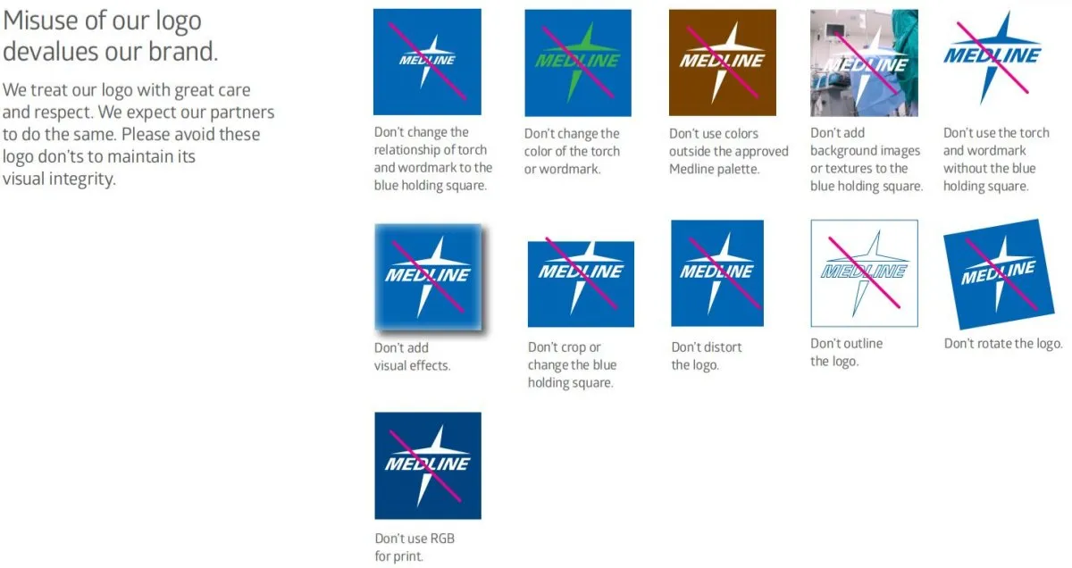
6 Red Flags That Signal Fake or Misused Medline Branding
Most counterfeit logos don’t fail because someone tried too hard. They fail because someone took a shortcut — a screenshot from a product page, a quick color eyedrop, a drag-and-resize without locked proportions. The result is a Medline logo that
looks
right from a distance and falls apart the moment you pay attention.
Here are the six signs that tell you something went wrong.
1. The color is off.
This is the first thing to check. Counterfeiters pull colors from low-res screenshots or uncalibrated screens. They end up with a blue that drifts toward gray, purple, or teal. The correct blue is sharp and saturated — #0052CC. Trust your eye if it doesn’t match.
2. The elements are separated.
The torch and wordmark belong
inside
the box — together, always. Floating apart is a clear sign that someone rebuilt the logo from separate pieces. They didn’t use the original brand file.
3. The box is distorted.
Stretched wide. Squashed short. Corners uneven. All three point to someone who resized the logo without locking the aspect ratio.
4. The logo is rotated or tilted.
Authentic official Medline branding sits flat and level. Any tilt — even a few degrees — means someone dropped the mark into a template and moved it around.
5. There’s a 3D effect, shadow, or emboss.
Medline’s mark is flat. No glow. No bevel. No metallic finish. Decorative effects are a sign that someone restyled the logo without permission.
6. There’s a background image inside the box.
Photos, gradients, textures — none of these belong inside the blue square. Their presence means someone embedded the logo into a promotional template. It was not reproduced from the source file.
The 3-second rule:
Check the color. Check the structure. Check the finish. Two or more failures from this list? Treat it as a
counterfeit medical supplies
risk and escalate right away.
Packaging Authenticity Checklist for Medline Medical Supplies
Real Medline packaging tells one clear, consistent story. A batch number that doesn’t match the outer carton — or a logo that shifts shade between two boxes from the same shipment — is a sign that something is wrong.
Use this checklist at the receiving dock, in the ward supply room, or anywhere a shipment arrives before it reaches a patient.
Basic Label Requirements
(Every single unit must pass)
Product name and specs
must match your purchase order — size, material, sterile/non-sterile status, and component count. No exceptions.The manufacturer’s line
reads Medline Industries, LP, with a full address. Any misspelling or missing city/country is an immediate red flag.The lot number
must appear on every inner and outer unit. No handwritten corrections. No ghosting or faded print.Expiration date
follows the format YYYY-MM or YYYY-MM-DD. Vague wording like “manufactured date + X years” is non-standard — reject it.Regulatory markings
(CE, FDA references, ISO) must be present and sized correctly for your region.
Cross-Unit Consistency Check
(Pull 5–10 units and compare side by side)
Medline logo
color, size, and angle must look identical across all units. No shade shifts. No tilt.Font weight and alignment
must stay consistent across every package. A single package with a bolder or narrower typeface needs a closer look.Barcodes
must scan and return matching product and batch data in your system.Packaging material
must feel uniform throughout — same thickness, same surface finish across the entire box.
Immediate Isolation Triggers
Stop distribution and escalate right away if
any
of these appear:
Mixed logo styles or clearly different blue tones within one shipment
Missing lot number, expiration date, or manufacturer details
Heat-seal edges that are doubled, broken, or show signs of re-sealing
Non-factory labels placed over the original printed text
Take photos of everything. Contact your supplier and Medline’s official customer service with full batch details before any flagged units enter clinical use.
How to Double-Check Authenticity Through Official Channels?
Visual checks get you far. Official verification gets you certain.
Patient safety is on the line. “Probably fine” isn’t good enough. Here are three concrete ways to confirm what your eyes already suspect.
Download the Official Logo and Compare It
Go to medline.com — type the address by hand. Don’t search for it. Fake sites are built to rank.
Once you’re there, find the newsroom or media resources section. It’s in the footer under “About” or “Press.” Official brand packages include vector files (.AI, .EPS, .SVG) and high-resolution PNGs with a brand style guide attached. File sizes matter. A real logo file runs 50–500 KB for PNG, and up to several MB for vector formats. A 5 KB image someone screenshotted from a product page is not a source file.
Download the primary corporate logo. Print it at 1:1 scale. Hold it next to your packaging.
Check for spacing inconsistencies, color drift, and proportion differences. Any visible gap between what’s on paper and what’s on the package is worth escalating.
Contact Medline Customer Service With Batch Details
Before you call or email, gather everything:
Lot number, product name, specifications, and expiration date
Supplier’s full registered name and tax ID
Clear photos
of the logo, barcode, and any suspicious print areas
Use the official “contact us” or “Customer Service” form on medline.com. Don’t use a phone number found on the packaging itself. Counterfeit supply chains sometimes print fake customer service numbers on the box.
Response times run 1–3 business days for case confirmation. Full batch verification takes 5–10 business days. That includes checking whether the lot number exists in Medline’s production database and whether your supplier is part of an authorized distribution chain.
Verify Your Supplier Against the Authorized Distributor List
Real Medline product authentication starts before the shipment arrives. Cross-check your supplier against Medline’s authorized distributor records. An authorized partner can give you a current, stamped authorization letter. You can then send that letter to Medline to confirm it.
One clear warning sign: a supplier’s price runs more than 30% below standard procurement pricing with no verifiable invoice or authorization on file. Treat that channel as high risk before a single box is opened.
Conclusion
Spotting a
genuine Medline logo
isn’t about being suspicious — it’s about being smart. Counterfeit medical supplies can slip past even experienced buyers. Knowing what real Medline branding looks like gives you real confidence. You’ll trust what you’re putting in someone’s hands.
The blue-and-white square, the torch paired with the wordmark, the crisp print that never bleeds or blurs — these aren’t small details. They separate a product held to rigorous medical standards from one that looks the part.
So before your next purchase, run through the checklist. Verify through an authorized Medline distributor. And if something feels off — trust that instinct.
In healthcare, “probably fine” was never good enough.